
There are dozens of articles out there with general advice on making good websites.
But how do you actually create a website that gives you lots of entries on your training?
In this blog post we will present you with 8 tips on what you can do with your website for more training registrations.
Reflect the customer journey in your page navigation
Logical Page Navigation makes it easy for your visitors to quickly find the information they are looking for. By matching your page navigation with the customer journey of your users, you will be able to offer the users the information they are looking for at any time, thus converting more of the visitors.
In addition, good page navigation will help the search engines index your web site so that you rank in the search results and drive traffic to your website.
Here are some points you should consider as a training provider to determine if your page navigation is good enough:
- Is it easy to find information about your courses on your website?
- Does the user navigate through all the necessary information before they are presented with a sign-up form in an attempt to convert them?
- Is their attention drawn to your main selling points?
- Are your CTA’s so clear that it is obvious to the user where they should click?
To find out how your users are navigating your website, look at “behavioral flow” in Google Analytics and/or use tools such as heatmaps and recordings that you set up with for example Hotjar.
Select the correct placement form entry
Do not allow the user to navigate away from important course information to complete a registration form. There are two reasons why you should avoid this.
- Each time the user is sent to a new URL, you run the risk of the user canceling.The risk is particularly high if you have a slow website.
- The user loses the opportunity to double-check important training details when all training information is left on the site they were navigated away from.
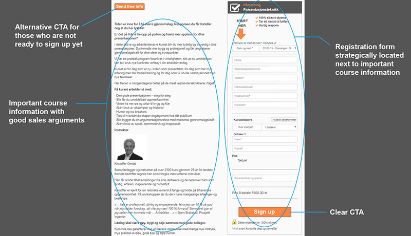
The optimum is to add the registration form next to your training description. Make sure the form is in close proximity when the user is ready to convert, and that all important training information is still available during form completion.
Scanlearn has done a great job with this:
Communicate the value of your training
Do you have one of the following two problems?
- You have posted lots of information about your courses on your website, but no one finds your information and therefore, no one approaches you or registers
- The traffic to your website is high, the page views are many and your courses are visible to potential customers.Still, you you’re not getting registrations.
As a solution, I recommend you make improvements to your training descriptions. Good course descriptions are essential for both being visible in the search results in Google and other search engines (in other words, for driving traffic to the page), as well as for converting course applicants to course participants.
It is in the actual training description that you write the phrases that make you appear in the search engines, as well as the phrases that provide the sales that convert training applicants to participants.
Highlight your positive customer reviews
I do not know about you, but I rarely invest money in anything if I do not find positive customer reviews backing it up.
And I’m not alone. A survey conducted by Dimensional Research shows that as much as 90% say they are influenced by others’ customer reviews when making a purchase decision.
Moreover: Positive customer reviews are the most credible form of marketing.
In other words, if your website is free of customer reviews, you should make sure to bring out your customer reviews and make them visible to your visitors.
And don’t hide them on a separate customer review page. Make your customer reviews visible in your training descriptions so that your visitors find them when they are in the right place in the customer journey (Reference to the point on navigation).

Here’s how we at FrontCore have included a customer review on our product page, Registration system.Don’t have any customer reviews to highlight on your website? I’ve written a blog post on how to get more customer reviews here.
Have simple registration opportunities on the website
This is perhaps obvious to many, but the fact is that many training providers still lack simple registration opportunities on their own websites.
“Send us an email to register” or “Call ********* to sign up” is not considered a simple sign-up option.
People prefer to register online. Booking Live has found that there are several reasons for this:
- Customers look for information online.
- Enrollment online can be done anywhere, anytime.
- Registration online is shareable;The user can easily send the sign-up link to someone they want to bring on the course.
- Online registration makes the user feel that they have control over the purchasing process.
Want more registrations? Lower the threshold for enrolment with good registration opportunities on your website.
Select the correct number of fields
When we first start lowering the threshold for signups, we do not get away from the number of fields in your registration form.
It can be tempting to ask for lots of information about your participants in the enrollment form.But how many fields can you actually have in your form without the risk of going beyond the conversion?
A lot of research on form and field optimization has been done, and the judgment is clear: The fewer fields, the better the conversion.
Formstack is amongst the players who have made such investigations. They have come to the conclusion that:
- Reducing the number of form fields to 10 or below increases conversions by 120%
- Reducing the number of form fields to 4 or below increases conversions by 160%
However, this does not mean that you should not ask the participant for information that is necessary for the registration to be complete.
Besides: If you have able to bring out the value of your courses and motivated the registrant sufficiently, they will be more willing to fill in more fields. This is well illustrated by Fogg’s Behavioral Model:
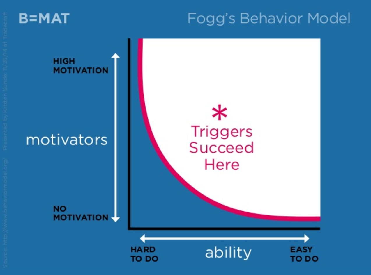
Source: Kristen Sunde, Slideshare
Serve your training on silver platter
Before presenting your visitors with a catchy description and a short and user-friendly registration form, you should give them the opportunity to get an overview of your courses. This includes what courses you offer, as well as when and where you offer them. This efficiently provides you with a clear training calendar.
By serving your courses on silver platter (Read: Training calendar), the user does not have to browse through countless pages on your website to find the training that suits them best. By making it easy for registrants to search for the right training easily increases the likelihood of registrations.
A training calendar will not only be perceived as user-friendly for your potential training participants, but it is also a great way to show (read: brag) about how much activity the business has before presenting the user for a signup form.
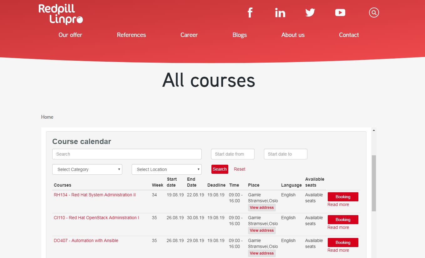
Here’s an example of a conversion-optimized training calendar. Redpill Linpro has here used FrontCore’s registration system with training calendar, where they have adapted the layout according to their own design profile and entered a contrasting color of the CTA button that captures the users’ attention. Here the user gets a good overview of the training offer before deciding on the training that best suits them.
Mobile friendliness
There are many reasons why it is important to have a mobile-friendly website.
One of the main reasons is that the global statistics show that 52% use mobile phones when searching for information online. This has resulted in Google’s “mobile first” indexing, which means that Google is using the mobile version of your indexing and ranking website. If your website is less user-friendly on mobile, you will experience lower ratings in the search engine – and therefore fewer visitors to your website.
Another important reason is that you lose entries if your registration form is not user-friendly also on mobile. According to surveys carried out on the topic, you lose as much as up to 30% of their potential registrations if the registration form is not optimized for mobile use.
Don’t have a mobile friendly registration form today? FrontCore’s enrollment system has responsive signup forms that work equally well on all devices.
Conclusion
If you want more registrations from your own website, you should let your page navigation reflect your customers’ purchase trip. Go for a conversion-optimized sign-up solution with a mobile-friendly training calendar and sign-up forms without too many fields to fill. And don’t forget the importance of having really good descriptions with customer reviews that really sell your courses!
Do as over 2600 other training providers
Use registration forms from FrontCore
Did you like this article? Don't forget to share it:


0 Comments